Welcome to a new feature on the blog, each Friday we will be bringing you a Master-class showing a different area of cardmaking, future features will including Alcohol Marker Colouring (Promarkers & Copics), Pencils, Different ways to use your Distress Inks, Brayering, Heat and Dry embossing, how to get the best from your Die Cutting Machines (including getting to know your machine) and Dies, making your own embellishments, how to use the same products in 3 or 4 different ways. We have already planned a number of the features, but if there is anything you would like to see on here please leave a comment and we will do our best to cover the topic.
Today we will be concentrating on colouring your stamped images with Distress Inks. So get yourself a lovely cup of tea or coffee and maybe a nice cream cake as this is going to be a long post:
Before we actually get down to colouring the images, I would like to give you some important hints and tips that will enable you to get the best results with your Distress Inks. Always use paper/card made especially for watercolouring, I like a really smooth paper without the rough texture you normally get with Cold Press Watercolour Pads after many trials and errors I have found the perfect pad that works for me – FABRIANO CLASSICO.5 HOT PRESS FAT PAD (300G) – this pad is available from Artifolk -This is the direct link to the correct pad – at J & C Creations we are trying to source this paper so keep checking our website. Another really important point is to use the correct Ink it must be a Solvent Ink Pad I have used STAZON Jet Black for this project but VERSAFINE will also work just as well but I would recommend that you heat set Versafine as it is more juicy than Stazon.
Finally never over wet your brush, it needs to be just damp, always keep a kitchen roll or tissues by you to dry and clean your brush on.
Before you start colouring have all your supplies at hand, for this image I have used the following:
Penny Black Slapstick Stamp – Pieces of Quite
A Sheet of your watercolour Paper/Card
Brushes
Distress Inks in the following Colours:
Tea Die
Tattered Rose
Festive Berries
Wild Honey
Forest Moss
Pumice Stone
Brushed Corduroy
Black Soot
Weathered Wood
Kitchen Roll/Tissue
Small pot of Water to clean your brushes.
White Ceramic Tile
White Ceramic Tile
Add a small amount of each Distress Ink to your Ceramic Tile this will be your palette, now we can start the colouring:
Flesh:
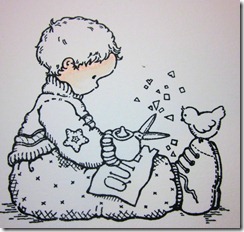
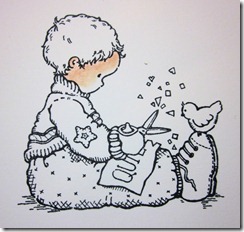
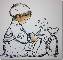
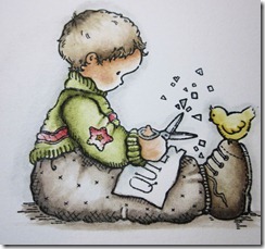
Pick up a little Tattered Rose Ink on an almost dry brush, paint a thinnish line around the outline of the face, after wiping your brush to remove any residue ink, gradually work the ink into the face using small circular motions, leaving the front of the face with hardly any colour at all. This should leave you image looking like the second one above.
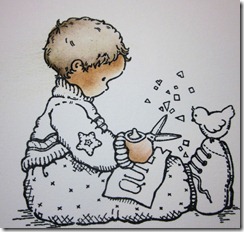
Now dip your paint brush into Tea Dye ink and mix with Tattered Rose, go around the edge of the face again blending as before so you are left with an image looking like the second image above.
Paint a very thin line of Tea Dye around the whole of the face and cheek area, then blend with short feathering strokes
This is the look you are looking for when you have finished colouring the face, the hand is completed in exactly the same fashion.
Hair:
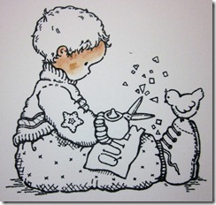
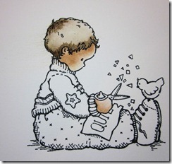
As previously you start colouring the hair by laying down a layer of ink on the image around the face and crown, Brushed Corduroy has been used here, remove all traces of ink from you brush and very carefully with small strokes spread the ink out leaving a light area between the top and bottom hairline
Now with the same colour ink add more colour and depth to the image as above.
Finishing the image:
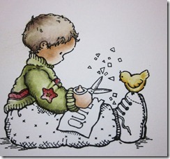
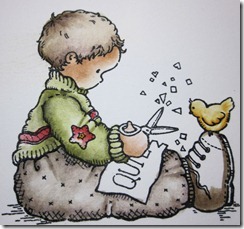
Using Forest Moss lay down colour as shown in the first photo above and following steps as before spread the colour further out into the jumper and add ore colour as necessary to achieve the result you require.
Next use festive Berries to colour the Strip and star on jumper and Wild Honey on the Bird blend the colour as before.
Your image should now look like the first photo above, pick up a small amount of Pumice stone and paint around the edges, clean your brush and blend the ink starting from each edge and working towards the middle of the area.
Add more Pumice Stone as required to give depth to the image (on this stamp the hatched areas show you where the colour needs to be the darkest). Now using Brushed Corduroy colour the boots. With Weathered Wood add colour to the paper on his lap and the scissors, whilst your brush is loaded with Weathered Wood paint around the whole image to give a hint of a shadow, then ground the image with strokes of Pumice Stone under his legs and boots. You have now completed your colouring and you should end up with an image like the final photo above
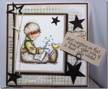
Here is the finished card.
Hope you have enjoyed this first J & C Creations Master-class, if you have any queries please do not hesitate to contact me at jacqueline_dennis@btinternet.com and I will try to answer them.
Thanks for looking











WOW!! This is a wonderful tutorial, you have really inspired me!!
ReplyDeleteHugs Sue
Great tutorial, makes a nice change to see colouring with something other than Promarkers, thank you.
ReplyDelete